

- My Satellite Setup
- TM 5402HD
Sky+ UK.
- My Location
- Scottish Borders
Would the map be more useful if the "no or very limited reception" reports were colour coded according to dish size like with the coloured blobs for the successful reception??
As you can see from the attached screengrab Ive only got a limited number of coloured icons to play with.
Now I dont really want to use the second row of markers as I dont think the negative reports will stand out enough from the positive ones. I reckon they really need to stand out from each other
However it wont be a big job to change over to use the pin markers on the third row.
Or are things ok as they are??
As you can see from the attached screengrab Ive only got a limited number of coloured icons to play with.
Now I dont really want to use the second row of markers as I dont think the negative reports will stand out enough from the positive ones. I reckon they really need to stand out from each other
However it wont be a big job to change over to use the pin markers on the third row.
Or are things ok as they are??

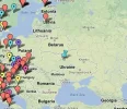


 outside UK,